UP Express
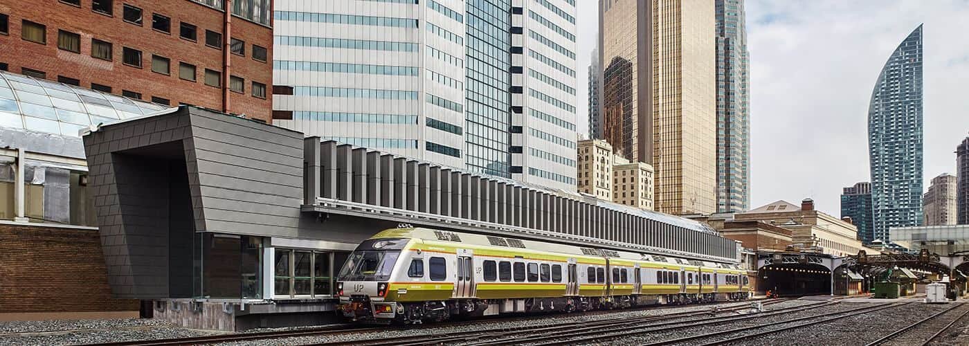
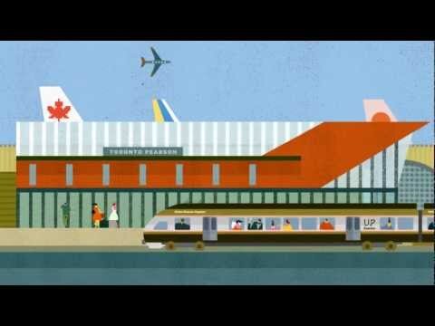
Helping to define the UI and UX for the Toronto based rail service which links the Airport to the city centre. We worked closely with the agency Winkreative who created the identity and brand guidelines for the launch of the service in 2015, in time for the 2015 Pan American Games. The railway carries 10,000 daily passengers (2.35 million annually), helping eliminate approximately 1.2 million car trips in a year.

There was an initial pre-launch website with detailed project plans, then the main site later with ticket booking that launched with the opening of the trainline. The design was a mobile first experience focussed on fast and effective ticket booking. We made it easy to choose a start position and easily determine which station you needed to travel to. Tickets could be purchased on-site and delivered a code that could be scanned at the gates from your device.

We worked on a rich set of content that helped travellers navigate the stations and Toronto upon arrival. The site at launch had an opinionated aesthetic to match the branding that set it apart from other rail services.
